In the unlikely event that we will ever be publishing a
_series_ of books, we’d better have a strategy to design the
_next one_ as we don’t want to go through this time-consuming
process each time. So we need a concept, a consistent
lay-out and a consistent color scheme.
Think of the O’Reilly
hacks books. Their concept is to have a white background with a
black&white photo of a tool on it, their layout is : a huge colored
title at the top and the authors at the bottom, their color-scheme is
set according to the topic but always using just one color! Pretty
simple, but extremely effective in creating a common look-and-feel for
the series.
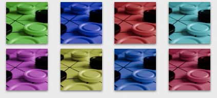
Our concept is to take a macro photo of a
mathematical game in duotone
.

Clearly, the game will vary throughout the series and may
even depend on the author (the example-game is Gipf). Duotone (that is,
converting the photo to grayscale and replacing white by another color
and adjusting saturation) because we are no graphic designers and have
no control on the final result if we would go for something more
involved.
Of course, the second color will also change
throughout the series. As we have no time to read interesting books such
as the color harmony workbook we just went for a
variation of the triad
color idea. That is,
Any three colors
with a balanced triangular relationship are triads. The basic triad
consists of three colors equidistant on the color wheel. The best known
of all color schemes are: the primary colors, red, yellow, and blue; the
secondary colors, orange, green and violet; and the remaining tertiary
colors, like red-orange and blue-violet. Triadic colors are usually
considered pleasing to the eye.
Given the
first color, we add first 120 and then 240 to its hue-value. For the 4th
color we take the opposing color (+180) and the 5th and 6th colors make
a second triad. For the 7th color we then have to go for +150 and form
another triad and so on and so on. An example of how such a series might
look is given at the top.
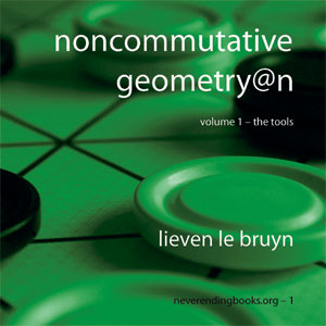
Finally, as for the lay-out, well,
it’s far from perfect but it’s the best we managed to do before
we got fed up with it. But, perhaps you might appreciate the stylish
hyphens in subtitle and in the numbering line, compatible with our own
chapterstyle.
Comments